2016: Real Wedding Invitation Suites
Almost as fun as looking at pretty flowers is looking at real, pretty wedding invitation sets. I think these seven photos help show what style my clients often have. I love looking at them as a group! Check out all the wedding venues I worked at in 2016 and see if you can match up the corresponding invitation.
Details: Classic and timeless ivory and gold with a custom monogram with a slight equestrian influence and a DC map envelope liner. Kate Spade bowtie pushpins used with the escort cards on a large cork frame.
Photo: Matt Mendelsohn

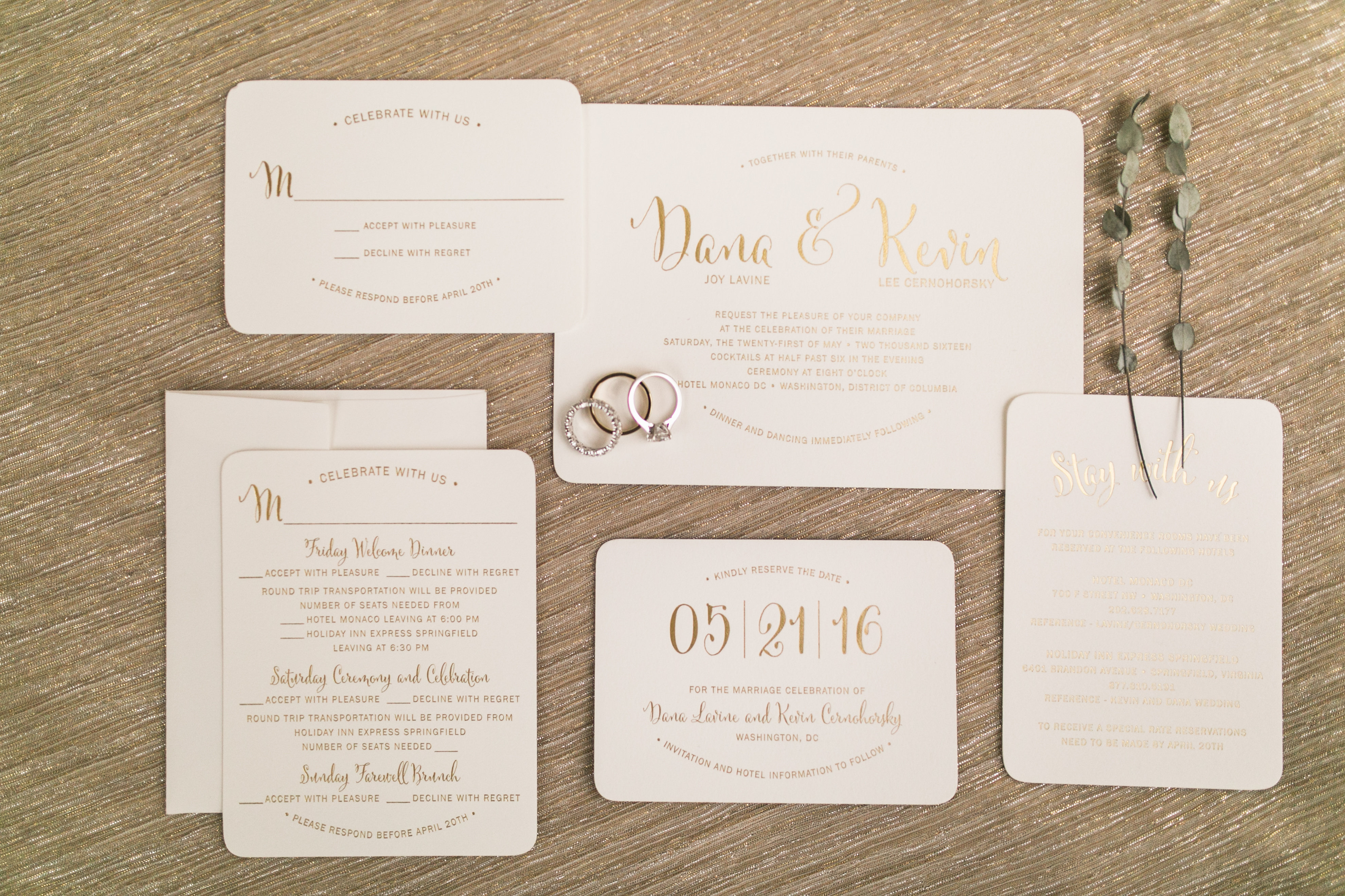
Details: Ivory and gold invitation with a whimsical font used for the names and numbers. I also love the arched phrases.
Photo: Susie & Becky
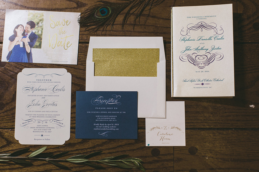
Details: Updated traditional invitation with navy and teal fonts and corner cut outs. Fun gold glitter envelope liner.
Photo: Taylor & Ben
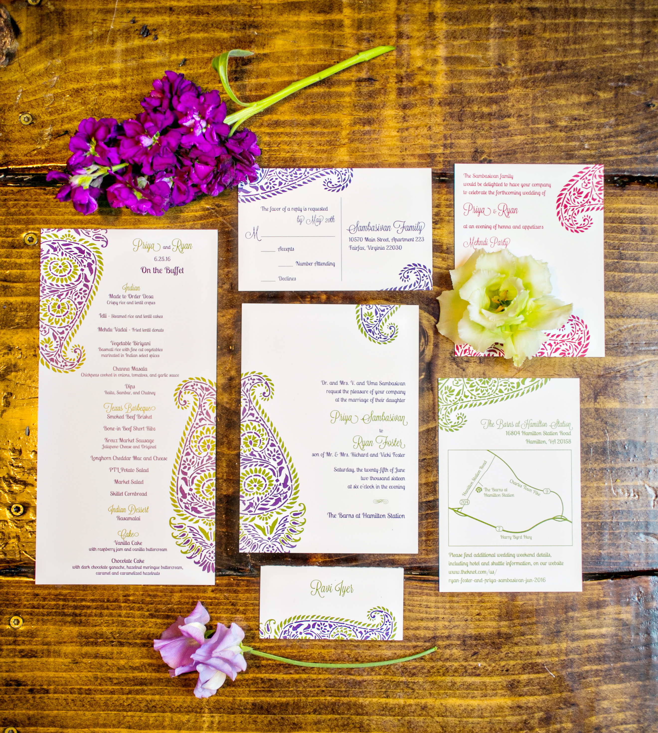
Details: Colorful wedding invitation set and menu card with an Indian-inspired paisley motif. Purple and green were our main colors here but we didn’t limit ourselves to just 2 colors!
Designer: Invitations by Ajalon
Photo: Kurstin Roe
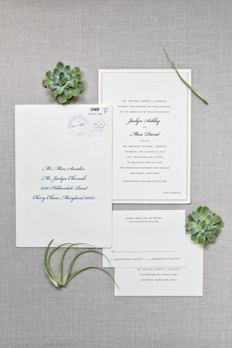
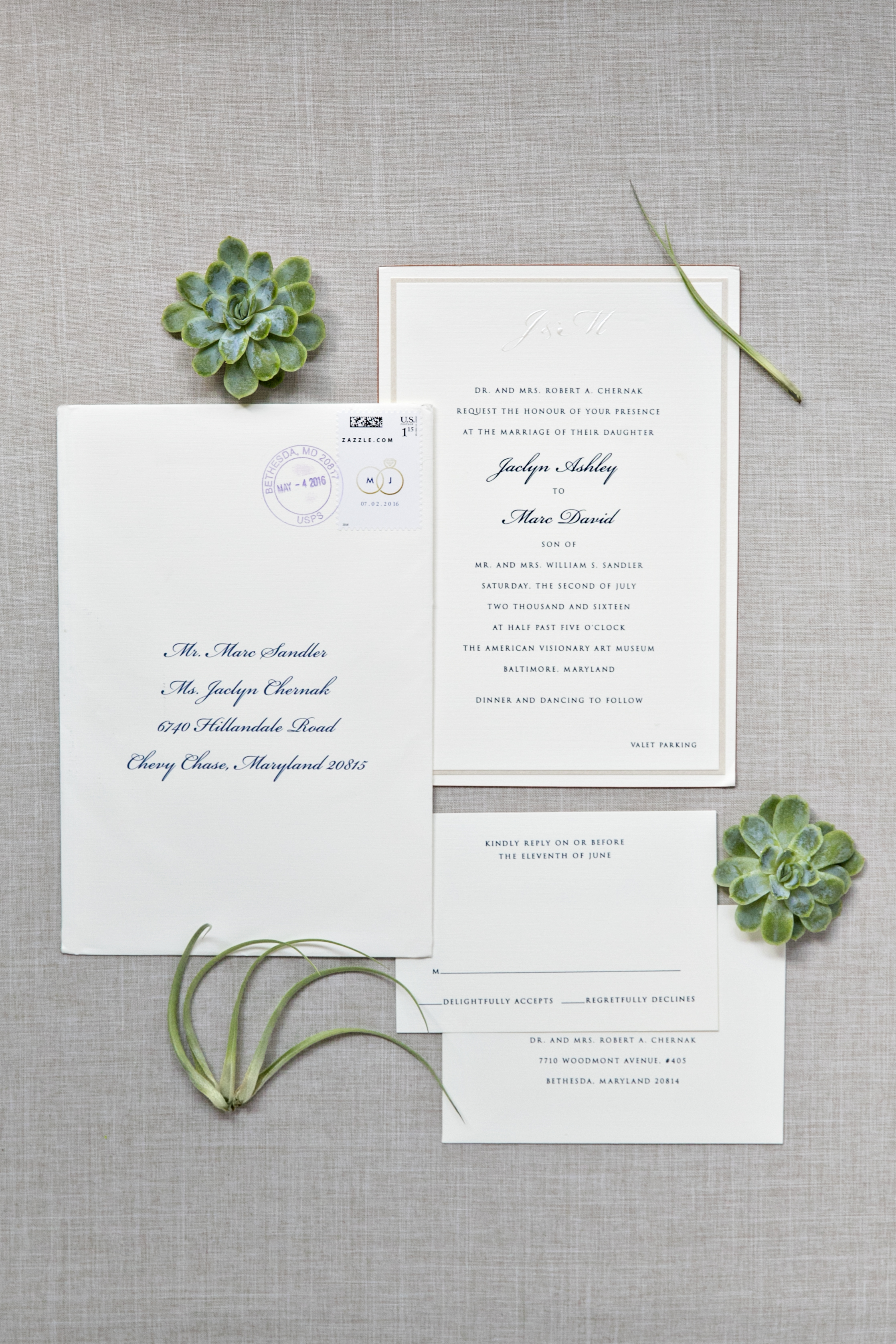
Details: Classic white wedding invitation with navy ink and a gorgeous copper edging.
Photo: Kurstin Roe
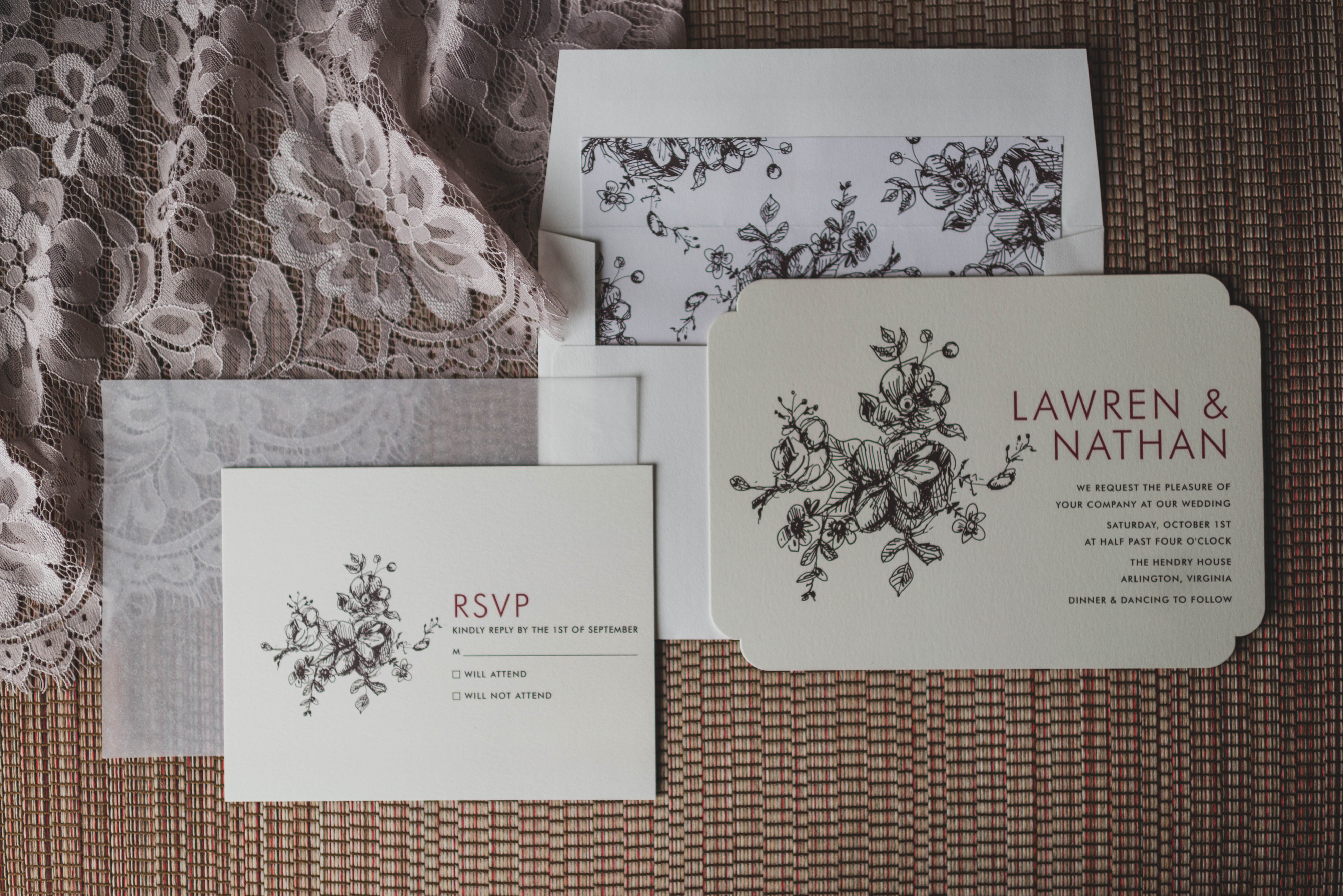
Details: Floral ivory wedding invitation with burgundy fonts and a black motif. Coordinating envelope liner makes it look so put together!
Designer: Minted
Photo: Stephanie Dee
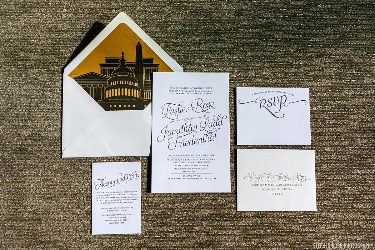
Details: Modern white wedding invitation with calligraphy style fonts and a stunning DC monument envelope liner.
Designer: Mother of the bride!
Photo: Stephen Bobb
Do you have a favorite? I can’t pick just one! I do love a great envelope liner and the copper edging on J & M’s invitation was so killer. What did or will your invitations look like? Leave me a comment!


