Wedding Invitations and Stationery: 2018 Real Weddings
Your wedding stationery is a super important aspect of your wedding design. The save-the-date is your guests’ first impression of your plans for your wedding day. Your wedding invitation is often still their main source for information and cues about your wedding day. I know you put a lot of work into that wedding website, but your guests can’t put your website on their fridge.
If you enjoy this post, look back at my recent round ups of my 2018 wedding cakes, wedding shoes, and a data-driven look at all our 2018 real weddings.
I also have round ups of wedding invitations over the past 3 years: 2017 weddings, 2016 weddings and 2015 weddings.
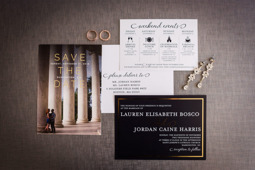
Gray and Metallic Invitations
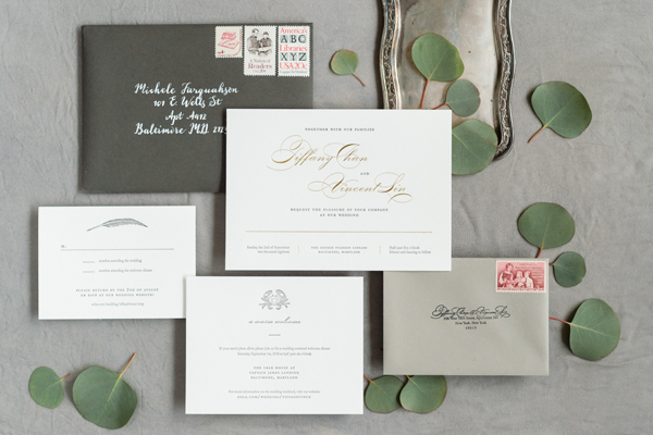
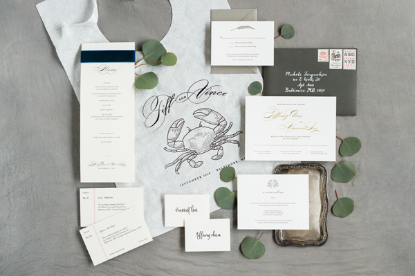
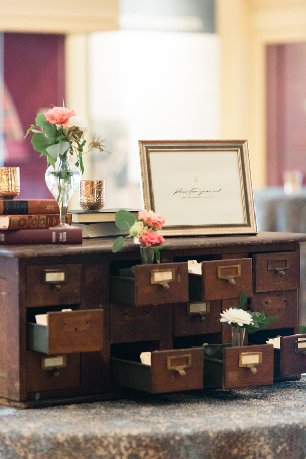
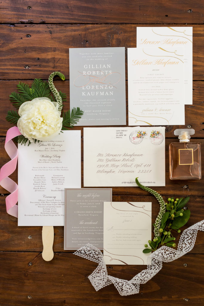
First up, a gray and gold wedding invitation with a nod to the wedding venue – a library. These were designed by the maid of honor, and a friend of the couple did the calligraphy as a gift. It takes a village. Below you will see more of their paper goods, including a bib for their crab feast welcome party. Third, our piece de resistance – the card catalog escort card display for their library wedding, expertly styled by Crimson and Clover.
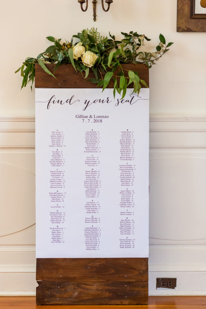
More gray, this time paired with rose gold, which isn’t going anywhere, anytime soon. This time we used Minted for everything, but still got some calligraphy help – this time from the mother of the bride. Speaking of the bride, she DIY-ed the seating chart with a template she bought online, I affixed it to the wooden board that I own, and LynnVale dressed it up with some leftover greenery.
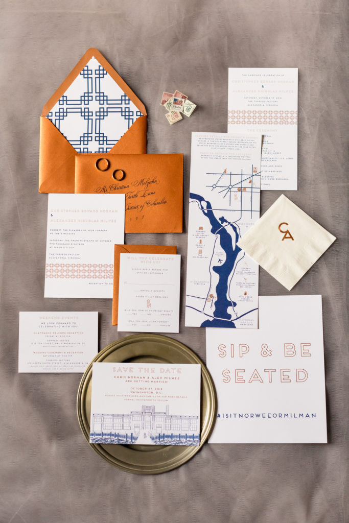
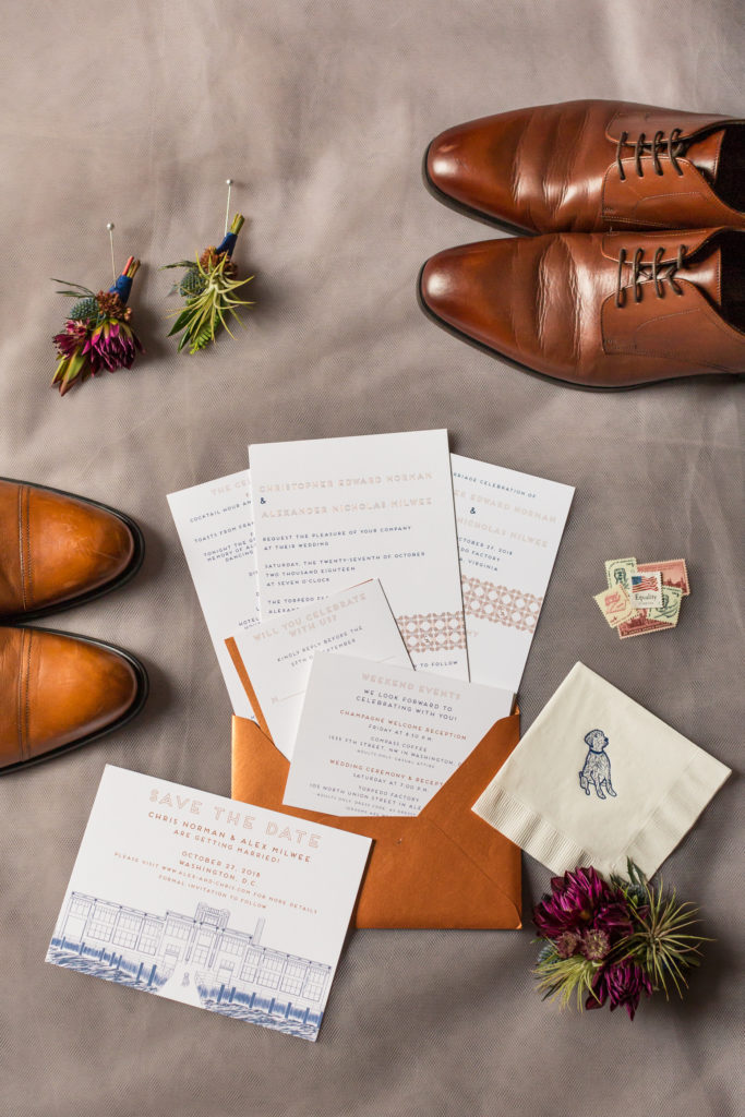
Copper and Navy Invitations
C and A worked with Paperzest to create this completely custom suite, including the sketch of their dog, Harper. We took the envelope liner pattern and recreated it on the wedding ceremony backdrop.
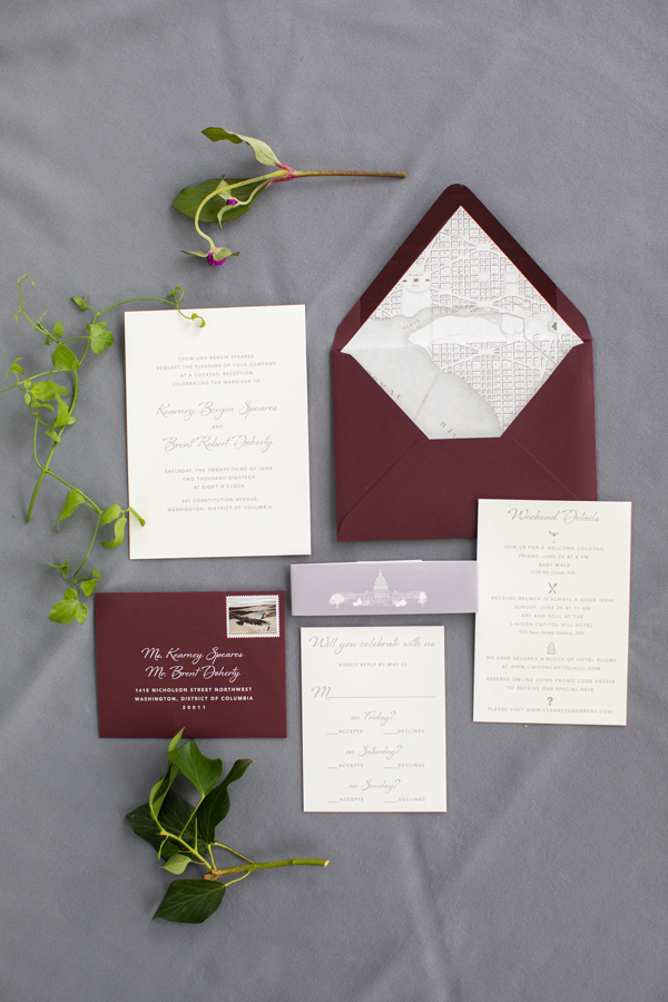
Merlot and Gray Invitation
Another Paperzest creation! This wedding was at 101 Constitution, which is a rooftop venue that overlooks the Capitol Building. So we used a lot of DC themed elements, from the map liner to the graphic on the belly band.
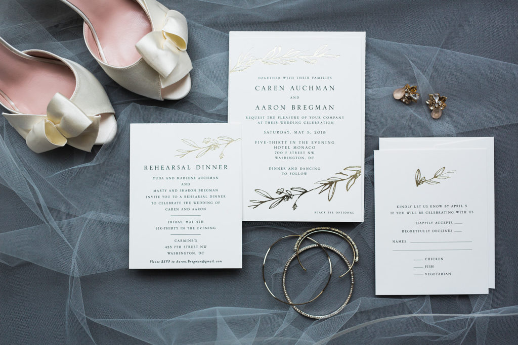
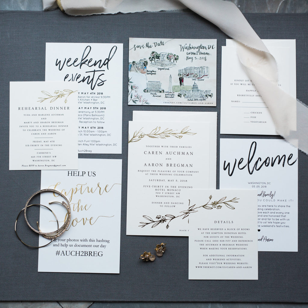
White and Gold Invitations and Stationery
I wasn’t involved in the design and planning of these wedding invitations, but I still wanted to share them with you. More is more, right?
What did your wedding invitation look like? Or what do you hope it will look like? Classic white is still very popular, with accents of metallics or black, navy or gray. But I challenge you to find a way to insert your personalities into your wedding stationery so that your guests say “this is so them!”


